
Designing Women

One of the more exciting parts of starting a business is getting to make a logo.
When we were in the planning stages of the farm, even before we put in an offer, we knew we wanted to name our farm something that would allow us to have a cool logo. We love tshirts (especially Doug!) and it was important to us to be able to put our logo on everything! One of the reasons we picked the name Sunshower Farms, other than it's obvious awesomeness, is that it has a lot of logo possibilities.
As soon as we had our name, we got Ashley on the job of designing the logo (remember Ashley went to art school).
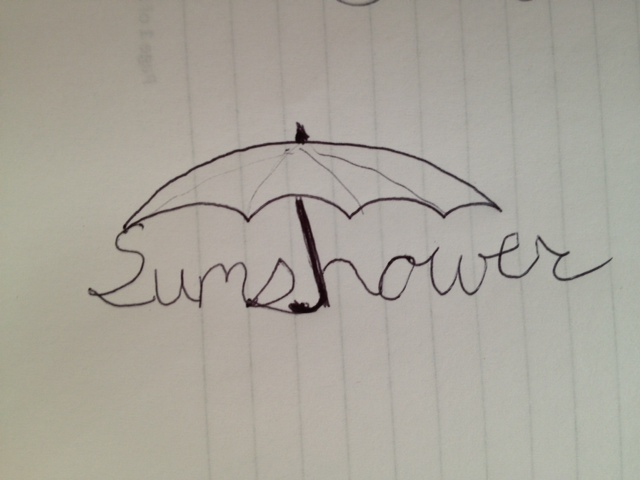
Here is a sketch of her first draft

We liked the idea of a raining sun, but we did not really like the way the umbrella looked - too pointy or something? Also it did not look as "happy" as we wanted. So Ashley and I brainstormed some more ideas. (Please excuse my terrible drawings!)
- We thought about having an umbrella in the lettering of our name.
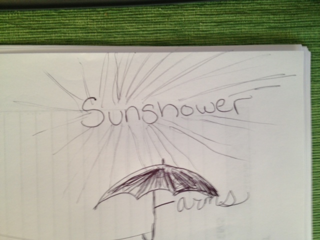
- With that lettering, what about a sun where the rays were actually droplets? And then have that sun raining on our name.

- What about instead of a sun with droplets, what if the sun rays were just shining down and we had a umbrella/parasol to keep them off our name?
So Ashley went to use Illustrator to take our ideas and make something awesome. In the mean time, we decided that we probably did not want the lettering of "Sunshower Farms" to be part of the logo. We would rather just pick a font and have it next to the logo.
Once we nixed the lettering, Ashley focused in on just doing an original "raining sun" for the logo. She sent us a ton of different suns to look at and pick from - here are just a few:
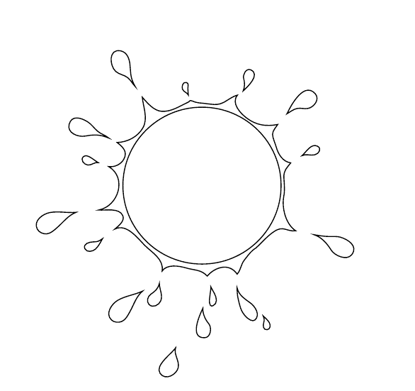


We wanted a logo that would look great in black and white or in color. So we liked logos 2-4 (the ones with the negative space filed in with black) the best. We also liked the logos where the drops were slightly more symmetrical. They did not have to be perfectly symmetrical, but at least balanced. Finally, we wanted the inner white circle of the sun to be a little smaller.
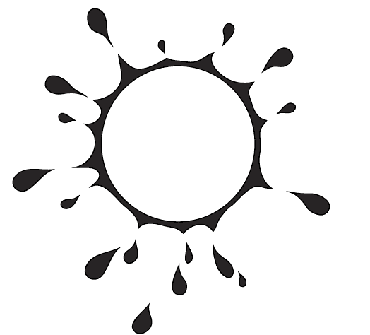
With those notes, Ashley sent us this draft -
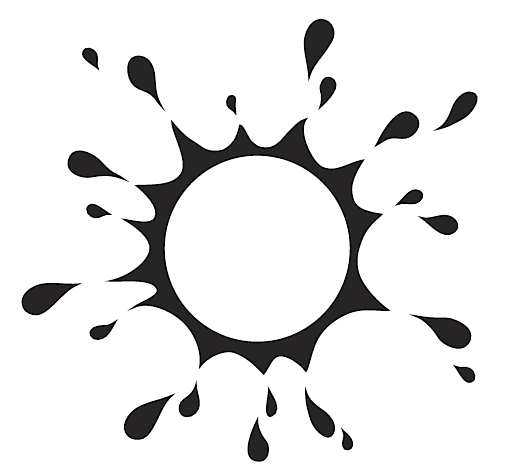
We loved the symmetry of the droplets, but we still thought the inner circle could be just a little bit smaller. All she had to do was adjust the inner circle a bit and bada-bing-bada-boom... we had our official Sunshower Farms logo!!
I love this logo! Ashley did an amazing job. It is well suited to go next to our name, or even stand alone (for example on a hat). We also like that we can print it in black or in white and it will still look good.
All we need to do now is pick a font! We still haven't decided - I will post some options for our dear readers to help us in an upcoming post.